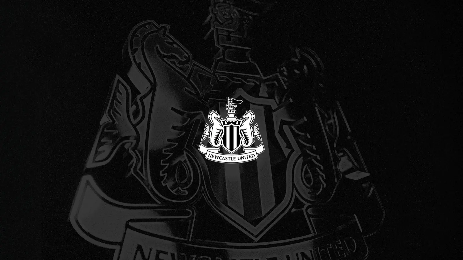
Rebrands of beloved logos often end in backlash. Newcastle United tried to avoid that by asking first. The Premier League club unveiled its new crest on 1 October, its first change since 1988, after a review that began in 2024 and more than two years of consultation with supporters.
Start with the problem, not the look
The club's case was practical. It said the old crest's detail and uneven lines did not display well on phone screens, in broadcast graphics, in stitching, or at small sizes and in motion. In its surveys, four in five respondents acknowledged those limits. That turned a matter of taste into a problem fans could see for themselves.
Ask how much change people want
The research also set the scope: 84% of respondents wanted the existing crest updated rather than redesigned. Designers led by chief creative officer Kenneth McIver produced thousands of variations and narrowed them to three. Chief executive David Hopkinson said supporters told the club to protect what it has, keep what they love, and not start again.
Let fans choose, from options you can live with
The final vote was open to 27,348 eligible supporters, including men's and women's season ticket holders and members, and was run independently of the club with the count verified. Option C won with 64.8% of first choices, against 19.0% for B and 16.2% for A.
The winning crest keeps the familiar parts and sharpens them. The castle, which gave the city its name, is bolder. A redesigned black and white shield is flanked by hippocampi, a nod to Newcastle's maritime history, and the lion, pennon and name ribbon are refined. Line weights are now even so the crest works small or large, in colour or mono, stitched or on screen.
 More from Brand StoriesPolymarket Takes Bets on SA's Mayors as Bookies Cry FoulAbout $379,000 has traded on Polymarket's markets for South Africa's eight metro mayors. Licensed bookmakers want prediction markets treated as illegal.
Roll it out slowly
The crest is being introduced across signage, digital and broadcast over the coming months, and will reach the kit only in the 2027/28 season, the club says. Retail plans are still to be announced.
What other brands can take from it
- Lead with a problem people can see, such as a logo that blurs on a phone, before showing any designs.
- Measure how much change your audience will accept, then design within it.
- Give the public the final say only between options you would be happy to ship.
- Make the vote credible: run it independently and verify the count.
- Phase the rollout so the change feels gradual.
The club consulted unnamed industry experts and has not named an outside design agency.