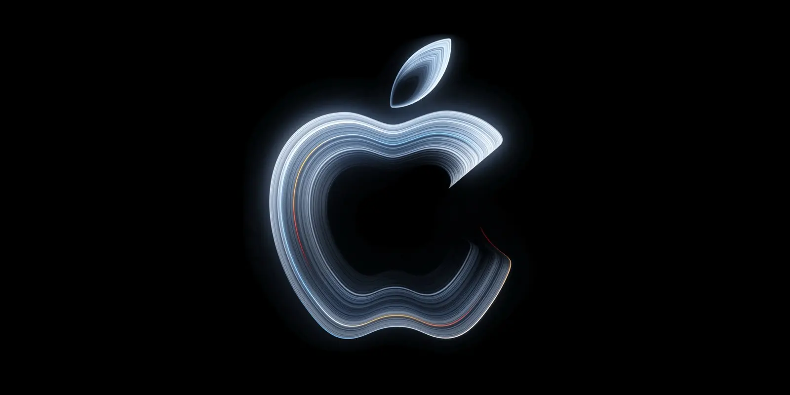

Apple Music is losing its red. Apple unveiled a new brand identity for its streaming service on 21 October, moving the look from red to black and white, MacRumors reports. The new logo and app icon had appeared earlier in the month, first in the fourth iOS 27.2 beta on 13 October, according to tech-ish.
Made by sound
Apple says the visuals were "made by sound". British producer Fred again.. and NEST Acoustics wrote a short original composition; its notes were played through a transducer that set a shallow bath of liquid moving, and a camera recorded the ripples and the light bending through them, with Apple Music brand elements placed behind. tech-ish says the imagery was captured entirely in camera. The composition doubles as a short sound signature for the service, the audio version of the logo.
What changes in the app
- The icon becomes a black musical note on white in light mode, with the colours reversed in dark mode.
- Some navigation icons and settings text switch from red to blue, and widgets get black backgrounds.
- The wordmark pairs the Apple logo with heavy lowercase letters in a customised version of Apple's SF Pro typeface.
- The liquid theme matches Liquid Glass, the translucent interface style Apple introduced across its software in 2025.
The wordmark had already appeared in marketing for Apple Music Hall, the live music venue Apple announced in London in September. The full rebrand rolls out with iOS 27.2 and macOS 27.2, which MacRumors expected the following week.