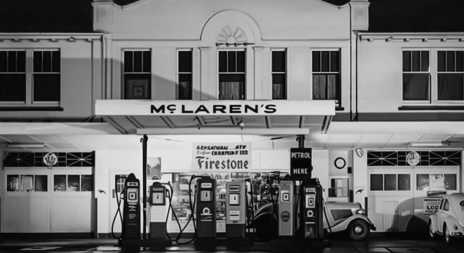
McLaren has rebuilt its brand by going back to a petrol station. On 22 September the company revealed an evolved identity that brings McLaren Racing and McLaren Automotive under one visual system.
Where the wordmark comes from
The new McLaren wordmark is inspired by the sign above the family service station in Remuera, Auckland, owned by Bruce McLaren's parents, Les and Ruth, McLaren says. It was where Bruce built the car that took him to his first racing win.
The teams built the identity by going through the shared archives of both businesses, looking for symbols and design details that had run through McLaren since Bruce's early years in New Zealand, according to the company.
What stays
The Speedmark, one of McLaren's best-known symbols, remains at the heart of the brand, and papaya orange stays central, McLaren says. Keeping both is deliberate: a heritage rebrand fails if loyal fans no longer recognise the thing they love.
Why unify now
McLaren says the new identity is meant to support a wider idea of ownership and fandom, with more personalisation, richer experiences and a stronger sense of community, beyond the cars and results on track. In plain terms, one brand is easier to sell merchandise, experiences and memberships under than two.